
The Magic of Black & White.
Removing colour from the image making equation somehow elevates the end result.

I don’t know why, but it quite simply does.
Agree?
Disagree?
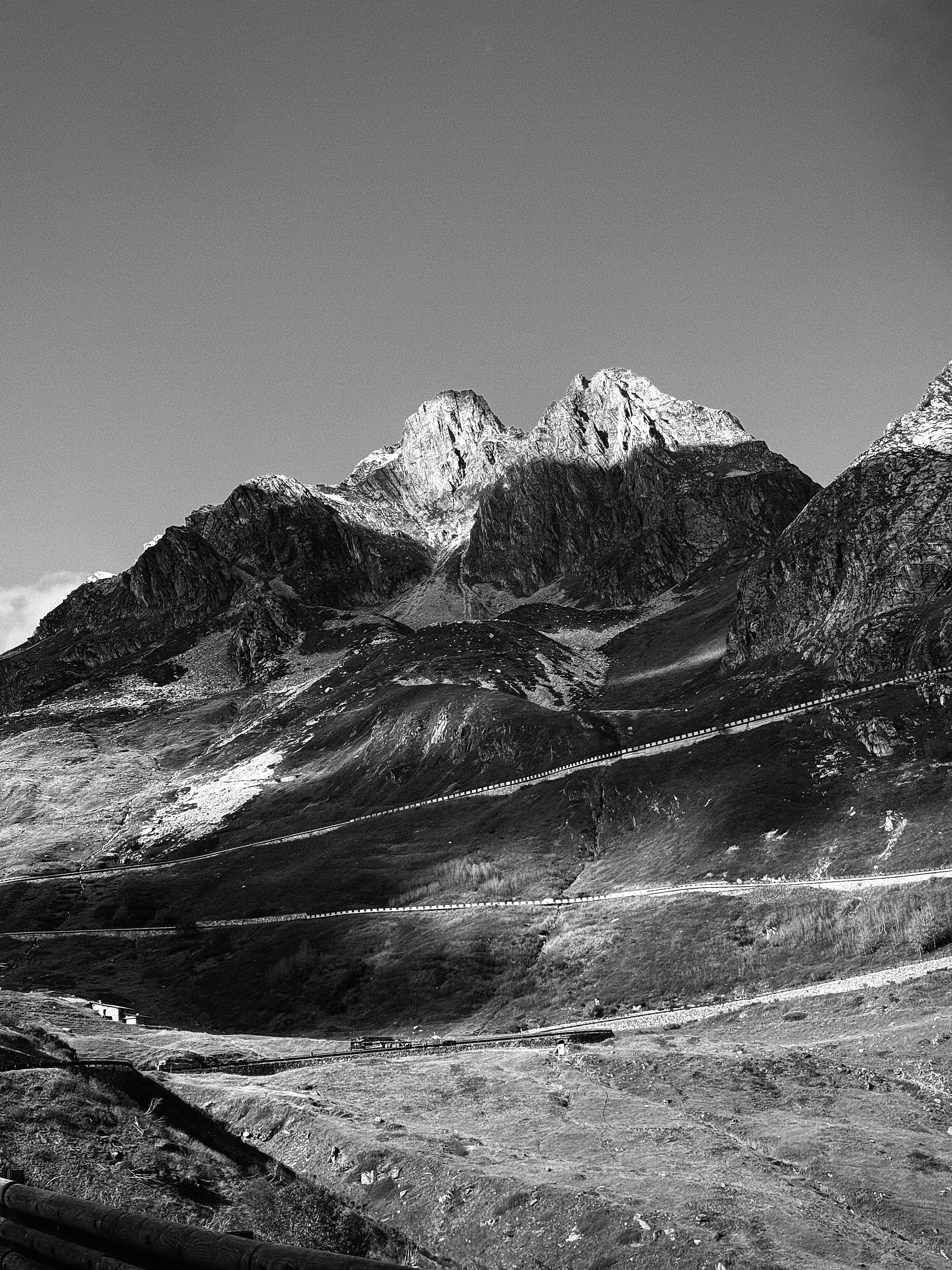
Take the image above, taken through the car windscreen, with my iPhone, as we were driving back from Italy to Switzerland over the Great St Bernard Mountain Pass.
It is something to behold, and a marvel of road engineering.
But in colour it just didn't have the same impact.
Well, I have some theories.
Mainly it’s the fact that it forces the viewer to look at other aspects of the image.
Composition and Form:
There is no distraction of colour.
So the viewer’s focus is drawn to the composition, shapes, textures, and contrasts within the image. So elements like light and shadow, lines, texture and patterns stand out more.
(As is the case - for me - in the picture above).
Simplicity and Abstraction:
When colour is not present, we often interpret the scene in a way we wouldn’t when colour is there.
This can lead to deeper engagement with the subject matter.
More emotion.
(Which must be why I can often find myself just staring into a b/w image for minutes on end.)
Timelessness:
Classic is classic, am I right?
Black & White Photography can convey a sense of timelessness or nostalgia. It often feels more classic or historical, evoking memories of an era when photography was predominantly monochromatic.
(Who doesn’t like a little reminiscing?)
So, what am I saying?
Well, quite simply that black and white photography strips the image down to its core elements.
Which can lead to a more profound or direct emotional and visual impact.
And the best part?
Each and everyone of us can make b/w images.
Heck, I might even make a print of this image even though it was shot on my iPhone (see below).
That’s it for this week!
Any interesting stories or thoughts to add?
Simply hit reply and let me know / comment below (so we can all benefit).
Have a great week!
—
Until next time ✌🏽.
Cornelius
The previous “Story Behind The Image”:
The Story Behind The Image: “Dancing Alpine Light”.

Side Note: Even though images are all around us, we rarely delve deeper into how an image came to be. As such, in this series, I share the stories behind some of my images. You can read the complete (growing) series here.
Enjoy this newsletter?
Forward it to a friend 👉🏽 sharing is caring 😊.
Join the Crew?
If you’d like to keep sharing the visual stoke together, sign up for Alpine Dispatches.
Looking for more / to connect?
You can find me on Instagram (photography, life, family) and X (photography, discussions, thoughts), as well as my website (portfolio, trying to be an adult 🤷🏼♂️).
Ways to support my work:
Subscribing (for free 🤠, or paid 😍) and joining the discussion.
Kitting yourself out in Seasonal Vagabond merch, here.
Investing in a fine art photographic print here.
Grabbing a set of b/w backgrounds for your phone here.
Contributing to a goal of mine here.
Or simply just buying me a virtual coffee here.
Yeah I think in general mountains work well in b/w, because of the shapes, textures. That's often far more interesting than patches of green, brown, grey. You can also bump the contrast in b/w to accentuate those shapes and textures, but with color that often turns into an unrealistic photo.